Colour Trends for 2012 by Farrow and Ball

/images/farrow_and_ball_brassica_trends%5B1%5D.jpg

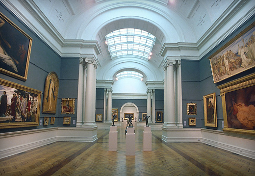
Scandinavian Drawing Room – Traditional or Modern

/images/farrow_and_ball_pigeon_trends%5B1%5D.jpg

Rural Cottage – Contemporary Japanese

/images/farrow_and_ball_railings_trends[1].jpg

London Terrace –  Warehouse Living

/images/farrow_and_ball_babouche_trends%5B1%5D.jpg

Tuscan Villa – Innercity Terrace

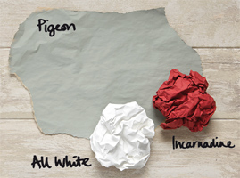
Farrow and Ball have been producing hand crafted paint and wallpaper in Dorset, England one batch at a time since the turn of the century.

They have a magnificent range of modern and traditional paint finishes….. my passion being their extraordinary heritage and restoration colours.

I have given you my first thoughts when looking at these new colour palettes.

The possibilities are endless!!!

 They are available in Australia through Ascraft and Decortex in Rushcutters Bay.

Neutral Palette for 5 Star Hotel Guestroom Patagonia

Wallpaper Magazine Editors Travel Picks – Patagonia, Chile

You may well think I am hooked on the neutral palette given yesterdays fashion post from the Sartorialist.  Those of you who know me also know that neutral is my great love in  life, both fashion and home.  When I do venture into ‘colour’, people comment.  It is very out of character for me.

I do adore this guestroom.  I have spent many years designing hotel guestrooms….most of which do not have this view!!!  I could see this working somewhere like Lake Jindabyne.

It is very sometimes difficult to convince hotel groups – the words are simplicity and elegance and yes !! a neutral palette. Some even still insist on ‘dressing’ the bed…..what could look more divine than this crisp white bedlinen….and hotels have the capacity to have it crisp!!!  I strive for this ….however never achieve this level of crispness.

I will share more of these beautiful hotels with you over the next few days.


How to Choose a Colour Scheme – Six Great Tips To Wow!

porters_paint

www.porterspaints.com

General Rule of Thumb

As a general rule of thumb, your colour choices (colour palette) should be planned for the entire home.  This will give you something to work with as you either work from room to room if starting from the beginning or over time with a gradual renovation.

 The idea is that colours should flow harmoniously from room to room and form part of an overall palette rather than every room be completely independent.  Each room can have a different feel based on either strength of colour, fabric choice etc as long as they sit within the overall palette chosen.

Preparation of a ‘Look and Feel’ Board (Sample Board)

By sitting samples together on a board the juxtaposition of colours, fabric and textures will allow you to create a visual image of the feel you are trying to create.

The preparation of a sample board will also allow you to create a look and feel (scheme) that will sit with your existing colours if required.

A good place to start is to find a photograph in a magazine of something that reflects the palette of colours that appeals.  It could be of something in nature, a landscape, seashells etc.

By collecting paint chips or brushouts and samples of other materials to be used such as fabrics, floor material, tiles etc and arranging them on a piece of cardboard, you will build up a picture or image and feel of the room/ rooms.

It is important that the samples shown reflect in general the proportion of the material that is going to be used.  For example, a fabric that is only to be used for cushions would only take up a small space on the board with floor and wall materials and colours predominating.

Things to think about when deciding on your colour palette

1.  Your environment – Where you live will have a bearing on the colours you choose.

For example, the crisp, clear and brighter colours that work so well at the beach with its strong light, can look quite wrong when used in the country with the more subtle shades of the fields, gum trees etc.

2.  Your surrounding landscape is an excellent place to start when putting together a palette of colours.

3. Climate is very important. In a very warm climate you may want to choose cooler colours and in a cooler climate your chosen colour palette can provide warmth. Colour can most definitely give the illusion of warmth or cold.

4. Orientation – The amount and quality of natural light that you receive at any given time of the day or each season will influence your choice of colour and can alter how that colour looks in your room. A certain colour used in one area can look quite different in another if the orientation of that room is different ie north or south facing. Artificial light ie use of lamps can have a similar impact on the colours used

5. How you use the room – The rooms use may affect the mood you would like to create.  You will want a different mood to be created in a formal dining room to that of a family room or a bedroom.

Within your chosen palette of colours you may choose to select a darker or richer shade for the formal dining room giving a cosy warm feeling and a lighter shade for the family room.  A family room will be a much busier area of the house with a greater number of elements and areas where colour can be added.  Starting with a neutral palette is often best for these areas.

Different shades of the same colour can add sophistication and using texture in fabrics, matting or artwork can lift a neutral scheme.

6. Existing Possessions – Very few people will start the process of putting together  a colour palette with no existing furniture or furnishings.  It is important to work out which of these you want to work with and which items you will recover or phase out over time.  Existing artwork/paintings/fabrics can often be a good starting point around which you can put together a colour palette that you like.

Good Luck !!!

Most Popular Topics

Editor Picks