The elegance of neutral bathrooms

/images/bathroom_1.jpg

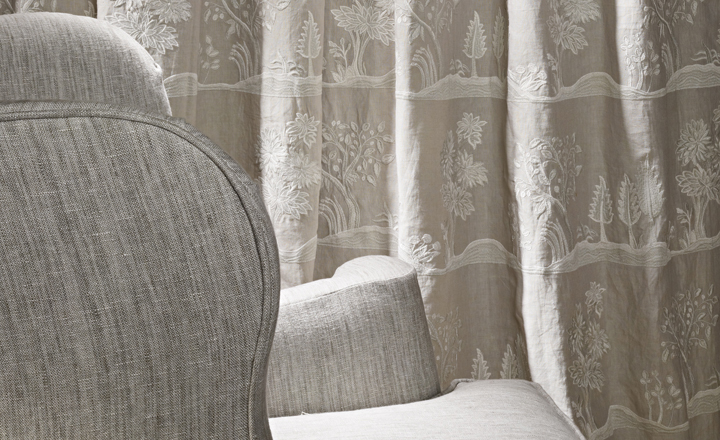
The simplicity of this bathroom is very appealing.  I am loving the neutral tones and finishes…..classic and elegant.

/images/bathroom_2.jpg

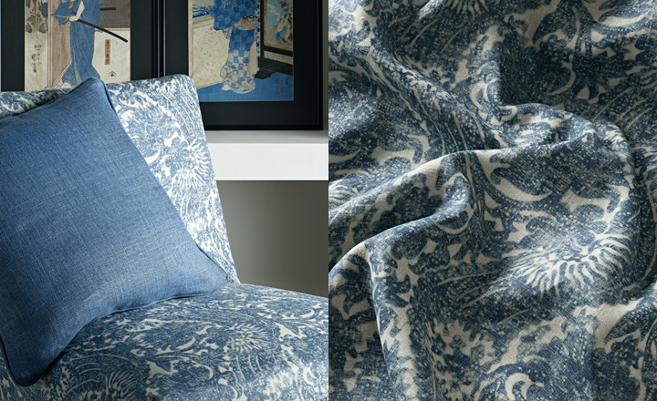
Let the accessories tell the story and create the feel and mood…..what ever that may be.  Bring in texture, warmth and contrast.

/images/bathroom_3.jpg

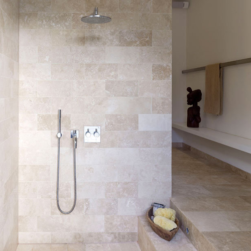
Natural materials have a natural warmth and texture and require little else. They provide their own contrast and variation within the material itself.

/images/bathroom_5.jpg

Slick and contemporary or rustic and earthy …. neutral works best.

The White Company London stocks the most fabulous range of everything one needs for the bathroom….online.

images: the style files

Vintage 21 modern classics look good on any bookshelf

/images/vintage-21-modern_classics%5B1%5D.jpg

In my hunt for weekend reading I discovered the most beautiful collection of books…..21 books in a rainbow of colours by Random House for the 21st birthday of Vintage.  Each book is not only a divine shade (with sprayed edges which look so good on a bookshelf) but they have a wonderful tactile quality with a supermatt finish.

The design of these books is quite stunning and titles include….Captain Corelli’s Mandolin, Atonement and A Week in December.

The bookstore had done an eye catching window display showing how spectacular these books look when put together.  It made me want to go home and re-arrange my bookshelves.

I know there are people who arrange their bookshelves/bookcases by colour……I have to say I have always been quite dismissive of this idea, however having seen the divine shades in this collection of books I am very tempted to either start a display of these alone…. or even use these shades as a start to a whole re-arrange by colour of the bookcase !!!

We all love a good bookshop and can just lose ourselves for hours browsing ….. the glossy and exquisite covers, the smell of the new books and the joy of discovery.  Who would have thought that a paperback with no pictures could excite to such an extent.

/images/vintage_21_modern_classics.jpg

Clever design for new baby

/images/jessica_comingore.png

This caught my eye when running through some favourite blogs.  So often impending parents get caught up with the boy/girl baby dilemma when decorating the nursery for the new baby.

For a start they are not babies for very long.  It can be a mistake to take the short term view and decorate a baby’s room with lots of baby colours and pattern….all too soon you are faced with a redecorating exercise.  This gorgeous room above, to me is very clever……both now and for later.  It is also rather clever if the sex of the baby is not known at the time you are decorating.

What could be smarter than a palette of soft grey and white where you can then add the appropriate splash of colour as above or pinks and reds for a feminine touch.

This scheme will stand the test of time and for an older child simply add navy, red, orange or even charcoal and silver.

I do love the horizontal stripe and these can be in any width.  It can be achieved by a painter, you painting or finding the stripe wallpaper you love.

/images/jessica_comingore_2.png

images: jessica comingore 

The sartorialist does navy, black and tan

/images/the_sartorialist_black_tan.jpg

Image: The Sartorialist 

Why is my eye always drawn to these colours together.  I think it is just so smart to have the subtle black, navy combination with a luscious tan contrast bringing it all to life.

Tan has been big in Europe this winter but I love it anywhere, anytime.  I was thrilled when I did my dark inky blue woollen armchairs in our sitting room to then find divine tan suede Mulberry cushions to contrast. These, apart from the timber furniture, were the only colour in the room as the walls are the same inky navy blue.

I also love the colour that the natural IL Bisonte leather bags and diaries go after using them lovingly…..tan !!

One of my favourite projects recently was a Polo Clubhouse/Bar Lounge where I did large tan leather armchairs and sofas with brass studded trim ….. and chocolate and cream tartan woollen cushions.  It looked fabulous…..the building itself was spectacular….lots of dark timber rustic panelling, natural stone fireplaces and very large terracotta flagging.

I still miss the greatest source of woollen fabric ever ……. yes mainly shades of tan, coffee and caramel……Fabric Fantasy in Commonwealth Street, Sydney.  Sadly now closed.  It stocked bolts of Italian suiting fabric bought out from the mills at vastly reduced prices.  I couldn’t stop buying it to cover furniture, make bedheads and valances and even tablecloths.  The colours were a dream !!

Where it’s at……hotel 27, copenhagen

/images/hotel_twenty_seven_copenhagen_guestroom.jpg

I keep reading about Copenhagen and thinking what a truly stylish city it is. Danish design has always been at the forefront ….fashion, furniture, architecture and interiors not to mention the arts.

Hotel 27 is in the centre of the city…..a heartbeat from where it is all at…..both culture and shopping !!

As you know, I have more than a passing interest in hotel guestrooms having spent a large portion of my life as an interior designer working on their design or redesign.  Hotel 27 has the hotel guestroom sorted.  The timber floors underpin the use of colour in the furniture itself… so different to the standard hotel guestroom. So simple, elegant and so well designed.  The colours are gorgeous…..slick, young and fresh. The attention to detail is brilliant.

/images/hotel_twenty_seven_copenhagen_detail.jpg

Hotel 27 has the warmth and comfort factor so often missing in a lot of inner city hotels.  Designers put together a lot of hard finishes and think that opulent furnishings will be the icing on the cake…..so often the spaces may have the initial wow factor but are simply not inviting.

The Danes do timber well.  The use of either timber flooring, panelling or furniture (or all three) creates warmth and gives a space a certain character.

/images/hotel_twentyseven_copenhagen_bookshelves.jpg

And now for some really vibrant Danish design…..iconic furniture combined with gorgeous fabrics for the Bar….only in Copenhagen !!

/images/hote_twenty_seven_copenhagen_bar.jpg

Displaying your collections in style

/images/coty_%20farquhar_%20sea_%20shells.jpg

image: coty farquhar

Displaying collections of what ever takes your fancy is a satisfying and pleasurable project.  It is giving a little glimpse of you and your favourite bits and pieces, old or new, precious or not to those who might admire them.

It may be more personal…..a collection on a dressing table ….. or it may be hung on a wall in a living room for all to see!!!

Either way it is a very individual and stylish way to make a statement….bringing together beautiful colours, texture, like with like.

Create attractive groupings within your spaces…. that you have put together…..your favourite things for a myriad of different reasons !!!!!!

.  shells collected on your holiday on a white platter or in beautiful glass bowl (see Coty Farquhar’s image above)

.  pretty china plates hanging on a wall or porcelain teas cups grouped on a sideboard…..take them out of the cupboard and display them !!!

.  silver tea set or silver bowls, platters or candlesticks and of course your silver picture frames……silver always lights up a room but polishing it all can be punishing !!!

.  cut glass or crystal is always so pretty… particularly if you do groupings of vases with a selection of freshly cut flowers from your garden …..just a sprig is all it takes.  These look gorgeous if spaced down the centre of a dining table. A collection of crystal wine and spirit decanters always looks warm and inviting with lamp light.

.  pewter has a special hue that seems to work with grey and white….it can be rustic or minimalist.

.  stacked wood in or beside a fireplace has a warmth and texture that can be a design element in itself.

. bookshelves are fabulous anywhere…the more the better…..whole walls of them !!!!  Books can be arranged randomly…..by subject or by colour !!!

.  folded linen sheets and pillowcases in an armoire or linen press….possibly my favourite thing !!!!

Designers guild shop online

/images/designers_guild_cushions.jpg

/images/designers_guild_cushion_2.jpg

I was thrilled to see that Designers Guild now have a fabulous online store for throw blankets, cushions, candles and floor rugs…..the quality of their fabrics is beautiful which I think you can see even from the photos.  Such a bonus to have the actual Designers Guild ready made cushions as I have spent years buying small metrage to have made into cushions for projects I have been working on.

These cushions, rugs and throws all co-ordinate with the various ranges of fabrics and you will find that Designers Guild will do a whole collection in a particular colour palette which makes it easy to put together a scheme for a room.

I did blog about their fantastic tote bags made out of smart Designers Guild fabrics a while back.

My favourite ever Designers Guild fabrics are their Royal Collection based on archives of fabrics in Windsor Castle and Buckingham Palace…..in fact now that I am thinking about it….. I might just follow up with that story and show some of those magnificent fabrics next.

/images/designers_guild_interior.jpg

More trade secrets…..designers little black book!

/images/society_at_ondene.jpg

Ondene ….. magnificent linen, cashmere, furniture, lighting and on it goes !!!  All so elegant and so beautifully presented. I adore their earthy colour palette… my real passion ….the Society linen. Tucked away in Transvaal Avenue you really need to know it is there.

Ondene   12 Transvaal Avenue, Double Bay 2028 PH: 93621734

/images/paper_2.jpg

Paper2 is the only place to go for something totally different when it comes to stationary, cards, paper, invitations and much more.  This shop is all about beautiful design !!!  They specialise in personalised stationary and invitations…I have just loved everything they have designed for me.

Paper2  477 Crown Street, Surry Hills 2010 PH: 93181121

More beautiful fabric inspiration

/images/mark_alexander_neutral.jpg

I fell in love with this range of fabrics from UK designer Mark Alexander……very Hamptons……and the colour palette he works in is just beautiful.  Mainly neutrals but introducing colour in a very subtle way.

The range includes printed linens…..such quality…. textured linens, relaxed linens, artisan dyed, brushed and embroidered both traditional and modern !!!!

These neutral string tones above work so well with white, cream and other sandy tones….sisal matting….all punctuated with the warmth of dark timber.

Below, is the introduction of Indigo.  I have used this inky colour…..with black timber floor boards, white walls and mid tone sisal matting.  It has the same effect as introducing blue and white china…..classic and timeless.

/images/mark_alexander_indigo.jpg

Mark Alexander fabrics are distributed through Romo Fabrics available at Marco Fabrics in Paddinton, Sydney

Most Popular Topics

Editor Picks