How to do black and white … softly

/images/black_and_white_1.png

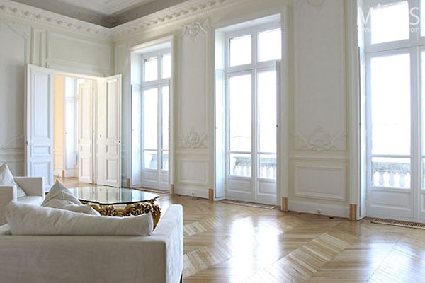
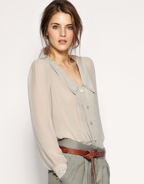
it is all in the detail …. a predominantly neutral palette with a hint black or charcoal …

/images/black_and_white_2.jpg

or a hint of buttoning, antique stud trim or cushion detail

/images/black_and_white_4.jpg

or a smart contrast … just one

/images/black_and_white_5.jpg

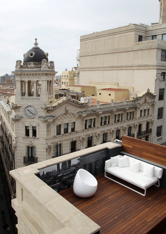
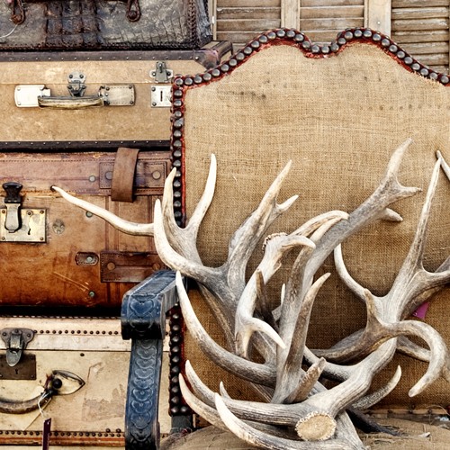
a distinct contrast in style, line and materials … this works

/images/black_and_white_6.jpg

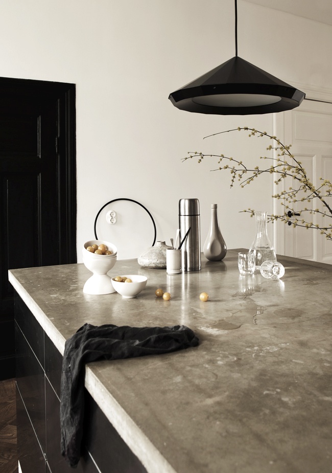
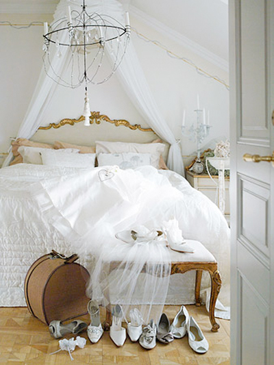
black, white and stone to soften

/images/black_and_white_7.jpg

the detail softens what would otherwise be … just black and white

/images/black_and_white_8.jpg

black, white and shades of grey … always !!

Soane britain … for craftsmanship and colour extraordinaire

/images/soane_britain_1.jpg

I am not sure if it has anything to do with the weather, however we don’t seem to embrace colour quite like the English.  Think of those cyclamen pink dining rooms that look so fabulous.  I am not even sure it works with our sunnier climate.

/images/soane_britain_2.jpg

Hence, my love for English decorating magazines … probably because ‘the look’, (their look !!) is just so different to anything we do here.  There is no right or wrong … it is just different!!

/images/soane_britain_3.jpg

Meanwhile, enjoy looking at Soane Britain … a beautiful website with beautiful products. They do ship to anywhere in the world, if you can bear to wait.

Beautiful bookshelves … working with colour

/images/bookshelves_1.jpg

Since my last post I am noticing bookshelves and bookcases everywhere and the ones that work really leap out.  The bookshelves above are my idea of perfection.  Such an interesting combination of colours, both books and decorative items.

/images/bookshelves_2.jpg

One could call this styling … the ability to put together bits and pieces that work … and it is all about having an eye for colour.  It is the combination of colours that pull it all together … or to be quite specific, always work with a complimentary palette of colours.

/images/bookshelves_3.jpg

Apply this principle to any collection whether it be bookshelves or dressing table. There is nothing as elegant as white or cream with a hint of soft metallic. Have a play and see what you can achieve.

Neutral palette with a splash of colour

/images/neutral_with_colour_1.jpg

Any neutral palette will come alive with the introduction of a little colour !

/images/neutal_with_colour_5.jpg

It could be anything from muted dusty shades to vibrant colour !

/images/neutral_with_colour_2.jpg

A black and white scheme looks sensational with a splash of … well, any colour really … hot pink, soft pink, bright orange, brilliant yellow or cobalt blue …

/images/neutral_with_colour_7.jpg

Refer to previous posts for tips on how to introduce colour into a neutral palette but it can be as simple as fresh flowers or a bookcase full of books.

A hint of gold …

/images/gilding_1.jpg

A touch of gold or gilt adds an element of warmth and style to any interior.  It looks best I believe, where the palette of colours used is minimal or neutral.

/images/gilding_2.jpg

There are no hard and fast rules for the placement of gilt mirrors except to say, the larger the better.

/images/gilding_3.jpg

This palette of colours and textures works like a dream.  Gilt … furniture or mirrors, adds a touch of elegance … or even faded glory !!

/images/gilding_4.jpg

For all your restoration requirements … whether it be regilding mirrors and picture frames or conserving your Old Masters, it is worth speaking to International Conservation Services who have a very impressive portfolio.

/images/gilding_5.jpg

Images: tumblr

How to do white well …

/images/white_1.jpg

Crisp, stark white is not for the faint hearted.  In fact most clients I work with shy away from white, on the basis that it is cold and uninviting !!  I beg to differ …

It is all about using it effectively and achieving the right balance.

/images/white_2.jpg

A white interior looks its absolute best where there are timber floors … of any shade or colour.  It is the perfect balance, with the timber providing the warmth.

/images/white_3.jpg

White on white is the ultimate in elegance … and it is all about the texture.  Try layering  rough and smooth.  I love the combinations of smooth white bedlinen and the texture of an antique marcella quilt or white linen loose covers on a sofa with silk velvet cushions.

/images/white_4.jpg

Of course you can always weaken and do white with a hint of …

/images/white_5.jpg

And for something really luxe … white with that touch of gilt.  Oh so elegant !!

/images/white_6.jpg

Working with white and its varying textures and tones will allow you to create a very sophisticated interior … not always achievable with colour.

images via thisisglamorous

5 ways with vintage style

/images/vintage_style_1.jpg

The trend toward minimalist interiors is I hope on the wane, with the pendulum swinging back to that of warmth and comfort … rooms that are inviting, lived in and have real character. Let your possessions provide the detail.

/images/vintage_style_2.jpg

1.  Display and use on a daily basis inherited pieces such as pretty porcelain or silver.  Don’t just store it in the attic or at the back of a cupboard.

2.  Visit antique shops and markets to keep your eye out for vintage finds … baskets, picture frames or collections of glass bottles to use as vases.

/images/vintage_style_3.jpg

3.  Collections of new or old books add character to any interior …  either in bookshelves or piles on coffee tables.  You can go a step further by displaying them by colour.

4.  Antique timber furniture of any period will always add warmth and texture. Often only one or two pieces are needed to make the difference in a very modern interior.

/images/vintage_style_4.jpg

5.  Choose a classic piece of antique furniture and recover it in a modern fabric.

It is the combination of old and new that gives character … and it should be constantly evolving not created in a few weeks.

Marimekko … all the fun and colour of summer

/images/marimekko_1.jpg

I have such fond memories of my marimekko curtains and bedspread, back in the day … it was the 70’s of course.  They were fabulous shades of bright green with large orange tulips.  The look extended  to green heart sheets and a gorgeous white peacock bedhead … all put together by my very stylish mother.

/images/marimekko_2.jpg

Brisbane was all the richer for Joy de Gruchy and The Craftsman’s Market, a design studio that stocked Marimekko and put Brisbane on the map. I have adored Marimekko in a nostalgic sort of way ever since.

/images/marimekko_4.jpg

How exciting to have our own Marimekko in Sydney … looking resplendent in the wonderful store in King Street. The colour is breathtaking and the space full of light !! Bolts of signature marimekko fabric, fashion and homewares.

/images/marimekko_5.jpg

I couldn’t help but pass on my source for peacock bedheads to complete the picture … The Family Love Tree.

Most Popular Topics

Editor Picks