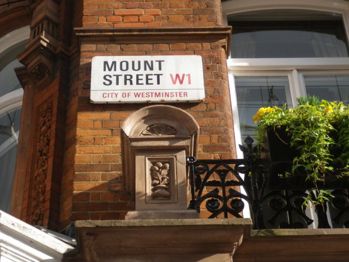
Conserving the history and cherishing the detail …

/images/aesop_mount_street_5.jpg

Mount Street, Mayfair is without doubt my favourite street in London.  Its architecture sets it apart from the rest of Mayfair … both its homogeneity and distinctive red brick.  New and edgy brands like Aesop (the Australian skincare brand), sit beside some of Mayfair’s oldest.

/images/aesop_mount_street_1.jpg

Aesop’s first London outlet, with interior by Ilse Crawford of Studioilse (who I have written about before), is located in a magnificent Victorian Grade II listed mansion block in Mount Street.

 /images/aesop_mount_street_3.jpg

Original parquet floors have been left raw, fireplaces reinstated and tall ceilings exposed. The end result has been widely celebrated.

/images/gewurzhaus_block-arcade_2.jpg

While soaking up the grandeur of Melbourne’s Block Arcade recently, I was similarly impressed … the extent to which period detailing had been incorporated as a design element in shop fitouts, rather than covered up as once would have been the case.

/images/gewurzhaus_block_arcade_1.jpg

Very simply put … it is the challenge in the juxtapositioning of old and new … and the delicate balance of getting it right.

5 ways with dark colour … timeless

/images/how_to_do_dark_1.jpg

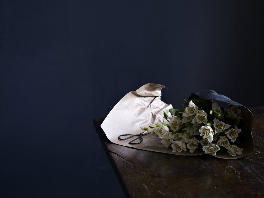
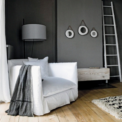
1. dark colours on walls really let the furnishings, artwork and in fact, anything else in the room, shine !!

/images/how_to_do_dark_2.jpg

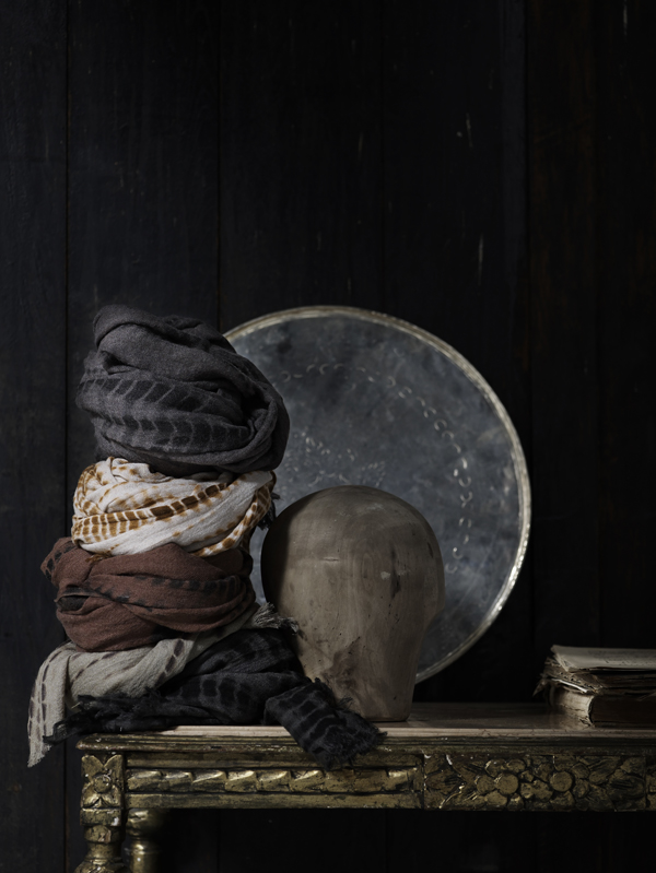
2.  dark colours on walls work particularly well with polished concrete floors and sisal flooring in natural tones

/images/how_to_do_dark_4.jpg

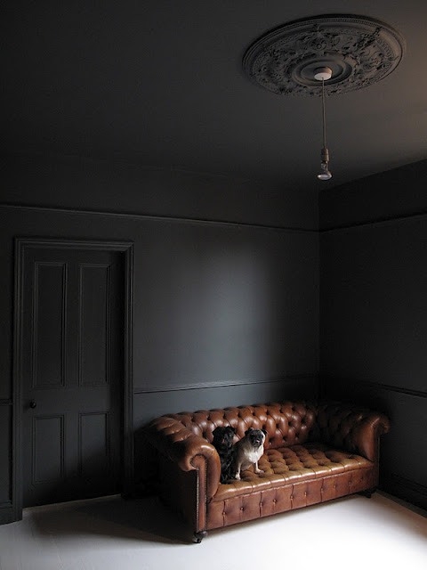
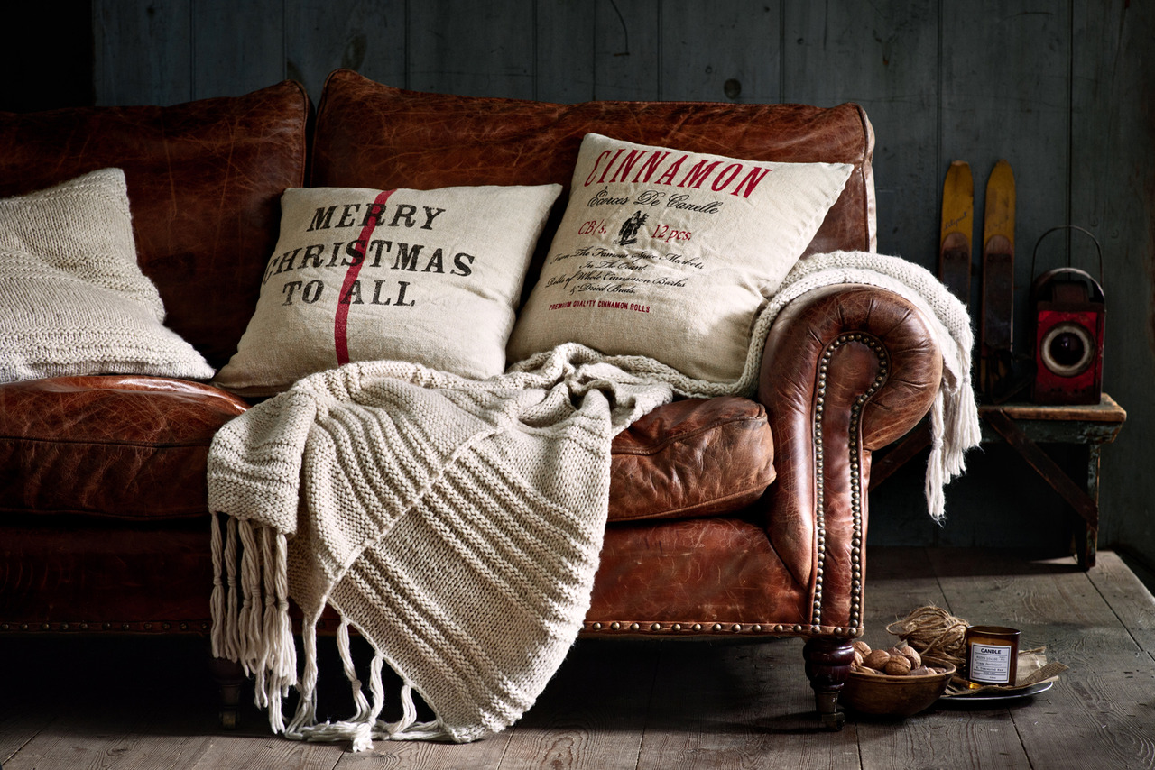
3.  dark walls show the richness of timber and leather

/images/how_to_do_dark_6.jpg

4.  dark walls are timeless … and classic style

/images/how_to_do_dark_8.jpg

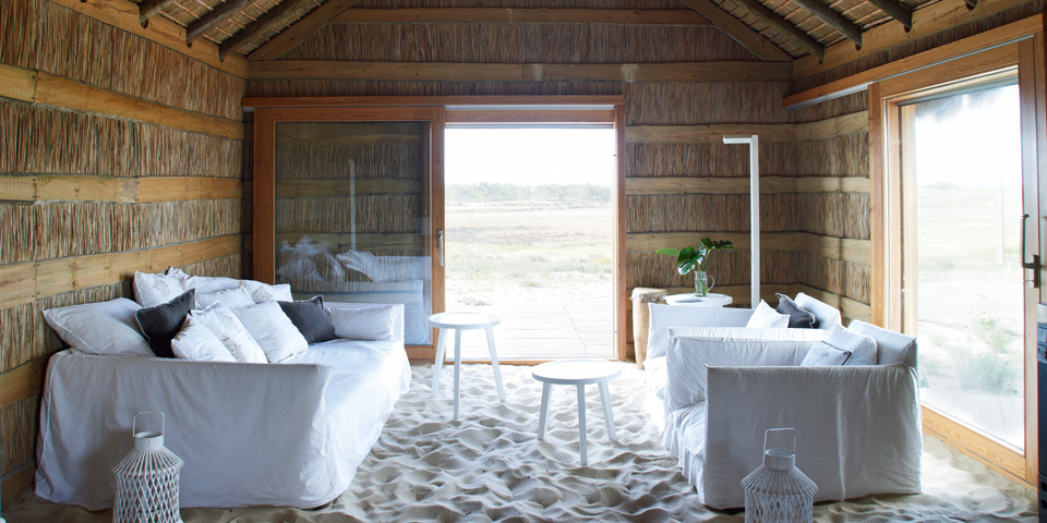
5.  dark colours are inviting in winter but equally so in summer, teamed with crisp white and pale timber … enjoy creating your own stylish interior.

/images/how_to_do_dark_5.jpg

images:browndresswithwhitedots

My gorgeous lunch with gervasoni

/images/gervasoni_furniture_blue_palace_resort_greece.jpg

I am sharing images of my favourite pieces of Gervasoni furniture, above and below.  I had the pleasure of meeting Michele Gervasoni last weekend at a gorgeous lunch overlooking Balmoral Beach … a sunny winter’s afternoon … perfection.

/images/gervasoni_furniture_comporta_portugal.jpg

It was interesting to hear how he and his brother, the third generation to manage this beautiful Italian furniture company, have expanded their market so enormously … and without any compromise. Their passion for attention to detail and use of natural materials always the hallmark of Gervasoni products.

/images/gervasoni_furniture_grace_mykonos_2.jpg

The fabulous Gervasoni website is a must and their collection extensive.  It is available in Sydney through Anibou.

/images/gervasoni_furniture_la_feline_blanch_france.jpg

The warmth of wood … now winter is here

/images/winter_1.jpg

Cold, wind and rain abound and we are thinking warm and cosy interiors and all that go with it.

/images/winter_2.jpg

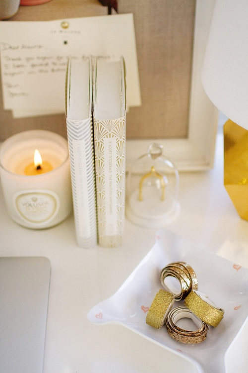
The glow of candles, bamboo lamp light and the warmth of timber.
/images/winter_31.jpg

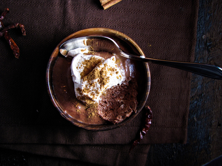
Earthy tones and rustic settings.

/images/winter_4.jpg

Exposed timber new or old, makes an architectural statement and creates its own warm colour palette.

/images/winter_5.jpg

The appeal of wool and cashmere fabrics no matter what colour palette.

/images/winter_6.jpg

The warmth of rustic materials, fabulous design and clever lighting .. so simple !!

images: tumblr, browndresswithwhitedots

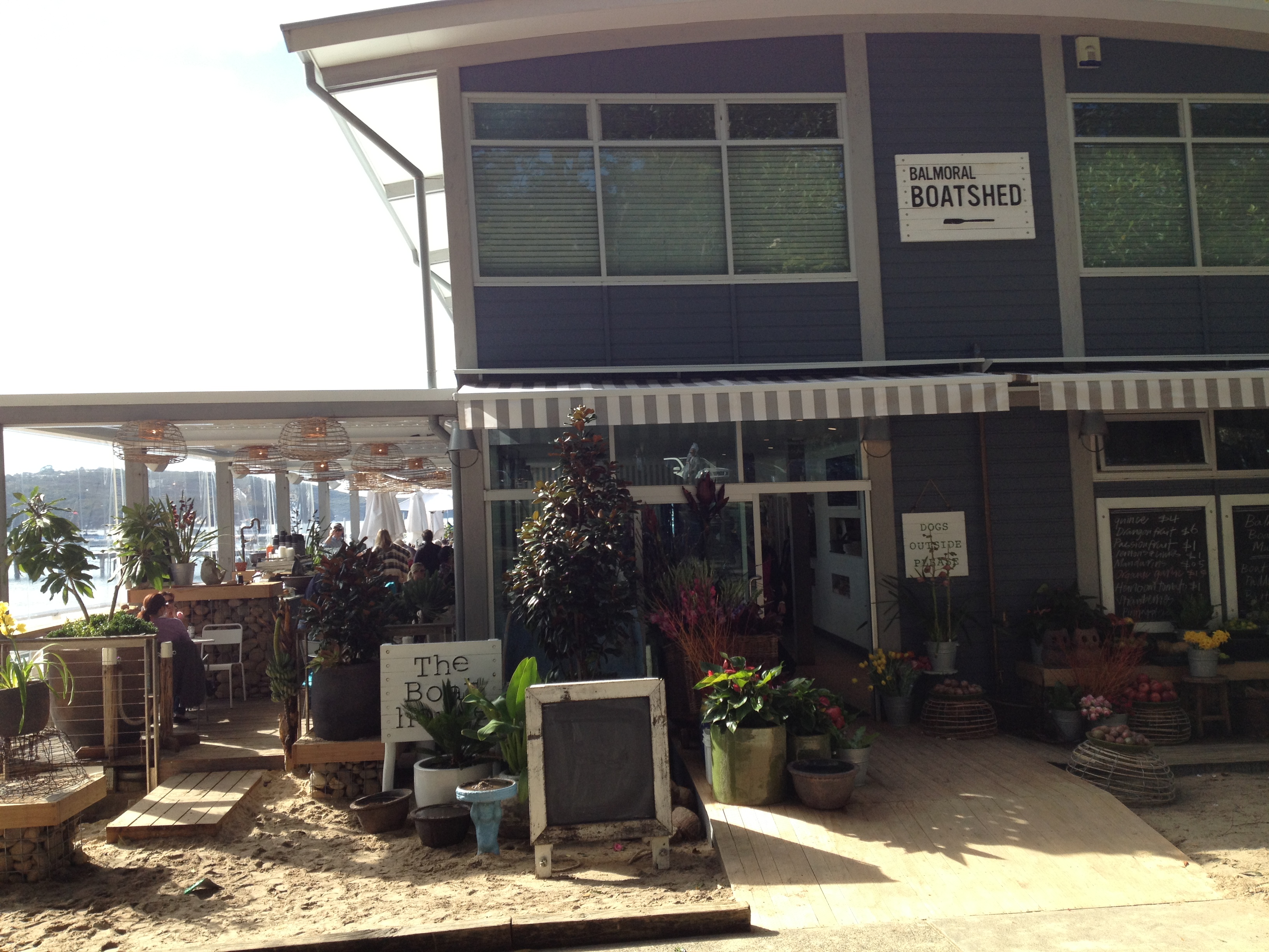
Balmoral boatshed … casual sydney cafe style at its best

/images/balmoral_boatshed_2.jpg

As they suggest, pop in with sand between your toes or slip into your Gucci loafers, it doesn’t get much more chilled than this.  The setting … divine, and the venue … oh so stylish.  This is Sydney living at its best.

/images/balmoral_boatshed_3.jpg

Not sure how one would describe the design concept … nautical … beach club with a touch of the luscious tropics … it just works !!

For a similar treat a little further afield visit The Boathouse Palm Beach … same cute concept, same clever operators.

How to do black and white … softly

/images/black_and_white_1.png

it is all in the detail …. a predominantly neutral palette with a hint black or charcoal …

/images/black_and_white_2.jpg

or a hint of buttoning, antique stud trim or cushion detail

/images/black_and_white_4.jpg

or a smart contrast … just one

/images/black_and_white_5.jpg

a distinct contrast in style, line and materials … this works

/images/black_and_white_6.jpg

black, white and stone to soften

/images/black_and_white_7.jpg

the detail softens what would otherwise be … just black and white

/images/black_and_white_8.jpg

black, white and shades of grey … always !!

Soane britain … for craftsmanship and colour extraordinaire

/images/soane_britain_1.jpg

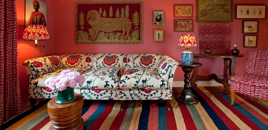
I am not sure if it has anything to do with the weather, however we don’t seem to embrace colour quite like the English.  Think of those cyclamen pink dining rooms that look so fabulous.  I am not even sure it works with our sunnier climate.

/images/soane_britain_2.jpg

Hence, my love for English decorating magazines … probably because ‘the look’, (their look !!) is just so different to anything we do here.  There is no right or wrong … it is just different!!

/images/soane_britain_3.jpg

Meanwhile, enjoy looking at Soane Britain … a beautiful website with beautiful products. They do ship to anywhere in the world, if you can bear to wait.

Beautiful bookshelves … working with colour

/images/bookshelves_1.jpg

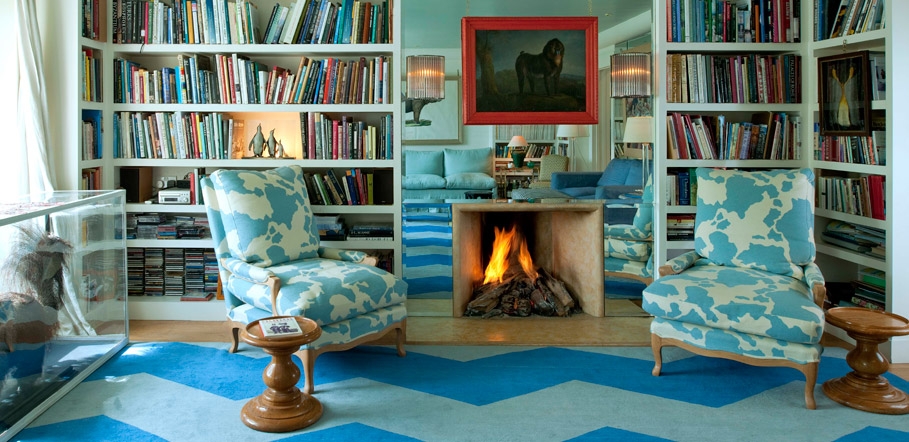
Since my last post I am noticing bookshelves and bookcases everywhere and the ones that work really leap out.  The bookshelves above are my idea of perfection.  Such an interesting combination of colours, both books and decorative items.

/images/bookshelves_2.jpg

One could call this styling … the ability to put together bits and pieces that work … and it is all about having an eye for colour.  It is the combination of colours that pull it all together … or to be quite specific, always work with a complimentary palette of colours.

/images/bookshelves_3.jpg

Apply this principle to any collection whether it be bookshelves or dressing table. There is nothing as elegant as white or cream with a hint of soft metallic. Have a play and see what you can achieve.

Creative walls … just when I needed help

/images/creative_walls.jpg

I had spent days fluffing around redoing the bookshelves, rearranging ornaments and nic nacs and changing our artwork … over and over, never quite happy with the end result  !!  You can imagine how thrilled I was to receive for Mother’s Day, Creative Walls – how to display and enjoy your treasured collections, by Geraldine James.

And I am supposed to be good at this sort of thing.  I do love it … the fluffing around bit … but to be able to flick through endless images of other people’s creativity does give you the added confidence to go with your own eye and instinct.  Sometimes you need to just walk away and come back with fresh eyes.

I did resist the urge to colour group the books in the library … mainly because there are just far too many books to start again.  However, quite some time was wasted repositioning a few according to subject matter.  I just had to put all our books on Churchill together, if nothing else.  I am absolutely fascinated by him since reading A Daughter Tale by Mary Soames … if only I had the time to read more.

Whether it is creating a monochrome, neutral or bold statement with your artwork or artefacts, I feel it all comes down to working with colour.  Play around with different groupings and your eye will tell you which colours just work.

A word of warning … hours will be lost in the process but the end result will be worth it.

Most Popular Topics

Editor Picks