5 ways with dark colour … timeless

/images/how_to_do_dark_1.jpg

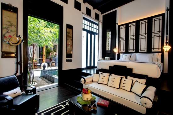
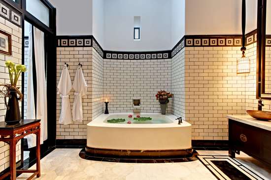
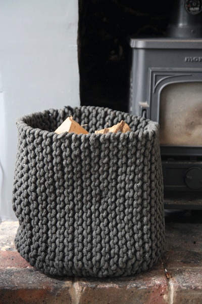
1. dark colours on walls really let the furnishings, artwork and in fact, anything else in the room, shine !!

/images/how_to_do_dark_2.jpg

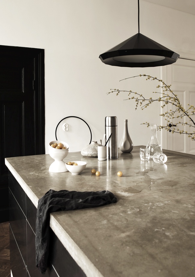
2.  dark colours on walls work particularly well with polished concrete floors and sisal flooring in natural tones

/images/how_to_do_dark_4.jpg

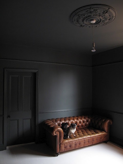
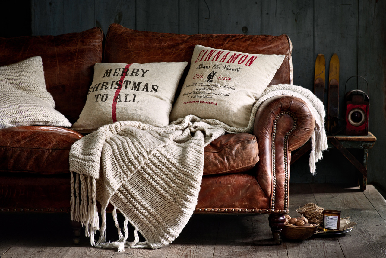
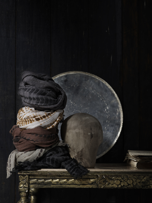
3.  dark walls show the richness of timber and leather

/images/how_to_do_dark_6.jpg

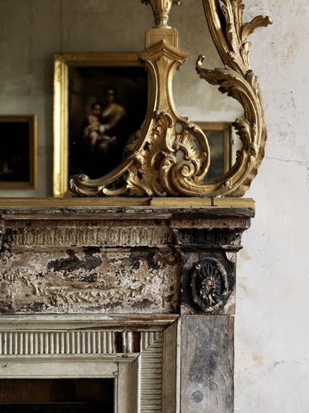
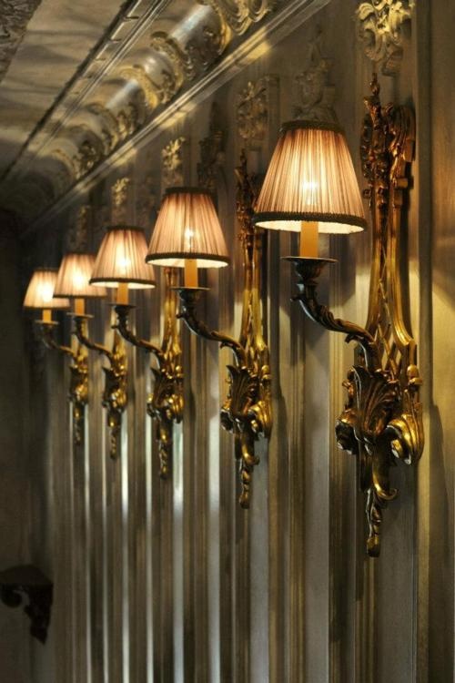
4.  dark walls are timeless … and classic style

/images/how_to_do_dark_8.jpg

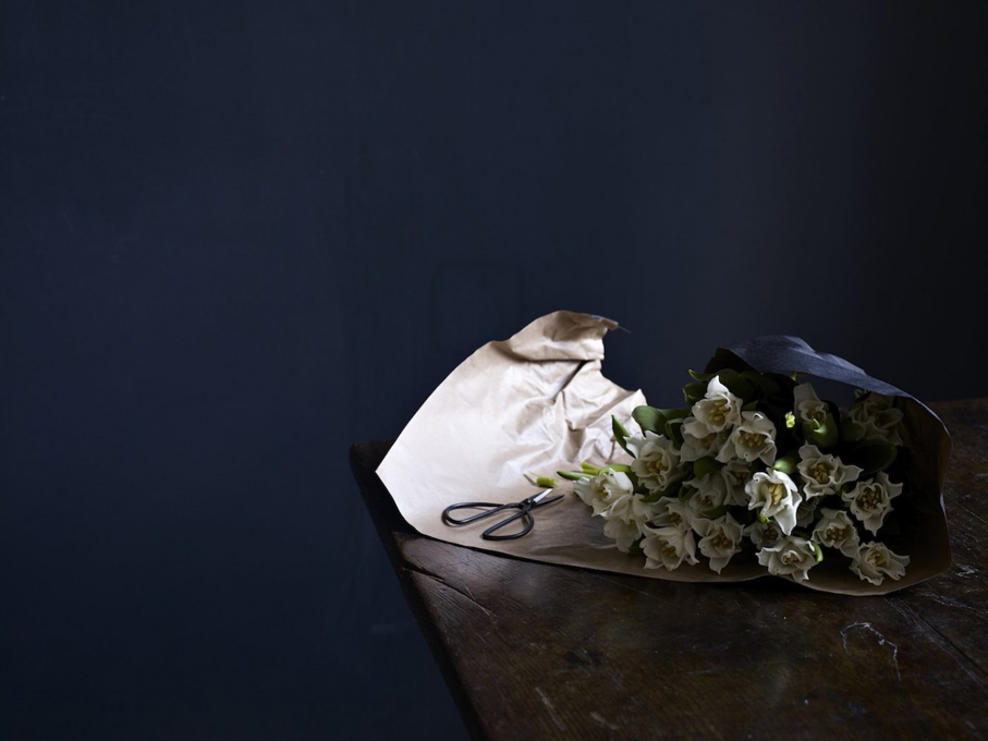
5.  dark colours are inviting in winter but equally so in summer, teamed with crisp white and pale timber … enjoy creating your own stylish interior.

/images/how_to_do_dark_5.jpg

images:browndresswithwhitedots

The warmth of wood … now winter is here

/images/winter_1.jpg

Cold, wind and rain abound and we are thinking warm and cosy interiors and all that go with it.

/images/winter_2.jpg

The glow of candles, bamboo lamp light and the warmth of timber.

/images/winter_31.jpg

Earthy tones and rustic settings.

/images/winter_4.jpg

Exposed timber new or old, makes an architectural statement and creates its own warm colour palette.

/images/winter_5.jpg

The appeal of wool and cashmere fabrics no matter what colour palette.

/images/winter_6.jpg

The warmth of rustic materials, fabulous design and clever lighting .. so simple !!

images: tumblr, browndresswithwhitedots

How to do black and white … softly

/images/black_and_white_1.png

it is all in the detail …. a predominantly neutral palette with a hint black or charcoal …

/images/black_and_white_2.jpg

or a hint of buttoning, antique stud trim or cushion detail

/images/black_and_white_4.jpg

or a smart contrast … just one

/images/black_and_white_5.jpg

a distinct contrast in style, line and materials … this works

/images/black_and_white_6.jpg

black, white and stone to soften

/images/black_and_white_7.jpg

the detail softens what would otherwise be … just black and white

/images/black_and_white_8.jpg

black, white and shades of grey … always !!

Soane britain … for craftsmanship and colour extraordinaire

/images/soane_britain_1.jpg

I am not sure if it has anything to do with the weather, however we don’t seem to embrace colour quite like the English.  Think of those cyclamen pink dining rooms that look so fabulous.  I am not even sure it works with our sunnier climate.

/images/soane_britain_2.jpg

Hence, my love for English decorating magazines … probably because ‘the look’, (their look !!) is just so different to anything we do here.  There is no right or wrong … it is just different!!

/images/soane_britain_3.jpg

Meanwhile, enjoy looking at Soane Britain … a beautiful website with beautiful products. They do ship to anywhere in the world, if you can bear to wait.

Beautiful bookshelves … working with colour

/images/bookshelves_1.jpg

Since my last post I am noticing bookshelves and bookcases everywhere and the ones that work really leap out.  The bookshelves above are my idea of perfection.  Such an interesting combination of colours, both books and decorative items.

/images/bookshelves_2.jpg

One could call this styling … the ability to put together bits and pieces that work … and it is all about having an eye for colour.  It is the combination of colours that pull it all together … or to be quite specific, always work with a complimentary palette of colours.

/images/bookshelves_3.jpg

Apply this principle to any collection whether it be bookshelves or dressing table. There is nothing as elegant as white or cream with a hint of soft metallic. Have a play and see what you can achieve.

Neutral palette with a splash of colour

/images/neutral_with_colour_1.jpg

Any neutral palette will come alive with the introduction of a little colour !

/images/neutal_with_colour_5.jpg

It could be anything from muted dusty shades to vibrant colour !

/images/neutral_with_colour_2.jpg

A black and white scheme looks sensational with a splash of … well, any colour really … hot pink, soft pink, bright orange, brilliant yellow or cobalt blue …

/images/neutral_with_colour_7.jpg

Refer to previous posts for tips on how to introduce colour into a neutral palette but it can be as simple as fresh flowers or a bookcase full of books.

Hotel guestrooms with a difference… the siam, bangkok

/images/the_siam_1.jpg

Without doubt it is the individuality of The Siam that sets it apart.  Renowned hotel designer Bill Bensley has incorporated the old with the new and created a unique 5 star hotel, full of charm.

/images/the_siam_2.jpg

This is not your typical hotel guestroom … with Thai Colonial influences, lamps hanging on black silk ribbons, travel collections … all so very personal.

/images/the_siam_3.jpg

The elegance of suites with sumptuous furnishings, exquisite detailing and such interesting memorabilia.

/images/the_siam_4.jpg

Memorabilia that has been collected and sourced for each of the individually themed suites.

/images/the_siam_5.jpg

Always glimpses to the exotic orchid filled gardens …

/images/the_siam_6.jpg

Black and white and distinctly Art Deco.  Such attention to detail.

/images/the_siam_7.jpg

I ask the question again, why can’t your average hotel guestroom, or even just the expensive ones, be that little bit more exciting or individual.  It isn’t only about the finishes and furnishings … it is about creating spaces that make patrons feel at home or somewhere better than home.

Milan furniture fair meets fashion week australia

/images/milan_missoni.jpg

I was spoilt for choice this week not knowing which to look at first … the Vogue blog covering Mercedes Benz Fashion Week Australia or the Vogue Living report each day from the Milan Furniture Fair.

/images/mbfwa_1.jpg

I was definitely more interested in Fashion Week’s Street Style than endless images from the catwalk !

/images/paola_lenti_2.jpg

Meanwhile in Milan, my favourites included Missoni (top photo) combining daisies and its traditional zigzag (only seen on the ottoman on the left) and above, the fabulous brights from designer Paola Lenti.

/images/mbfwa_2.jpg

It was all happening at Carriageworks in Sydney … what a fabulous venue for Fashion Week (yes, with the exception of the parking).

/images/paola_lenti_1.jpg

More of Paola Lenti’s collection ‘In the Key of Colour‘. The furniture is available through Dedece, Sydney. 

/images/mbfwa_3.jpg

Paola Lenti chose this fabulous Franciscan Monastery, complete with orchard and gardens, for the showing of their collection in Milan. 

/images/paola_lenti_3.jpg

images:vogue


A hint of gold …

/images/gilding_1.jpg

A touch of gold or gilt adds an element of warmth and style to any interior.  It looks best I believe, where the palette of colours used is minimal or neutral.

/images/gilding_2.jpg

There are no hard and fast rules for the placement of gilt mirrors except to say, the larger the better.

/images/gilding_3.jpg

This palette of colours and textures works like a dream.  Gilt … furniture or mirrors, adds a touch of elegance … or even faded glory !!

/images/gilding_4.jpg

For all your restoration requirements … whether it be regilding mirrors and picture frames or conserving your Old Masters, it is worth speaking to International Conservation Services who have a very impressive portfolio.

/images/gilding_5.jpg

Images: tumblr

Most Popular Topics

Editor Picks